Excel:
May 2025
Data Information:
200 transactions from a fictional retail company
Retail Sales Performance Dashboard (Excel)
This self-initiated project was developed as part of my personal learning journey to strengthen my data analysis and visualisation skills using Microsoft Excel. Working with a fictional dataset of over 200 retail transactions from 2024, I designed a dynamic, interactive dashboard to explore key sales metrics such as total revenue, regional trends, monthly sales patterns, and product performance. The goal of this project was to practice core Excel functionalities—such as data cleaning, formula application, PivotTables, and dashboard design—while simulating a real-world business scenario that supports data-driven decision-making. The final dashboard offers a clear, professional layout with slicers and charts to make insights easily accessible for stakeholders.
Step 1: Initial Data Preparation:
Before diving into analysis and visualization, the raw dataset underwent structured preparation to ensure accuracy and usability:
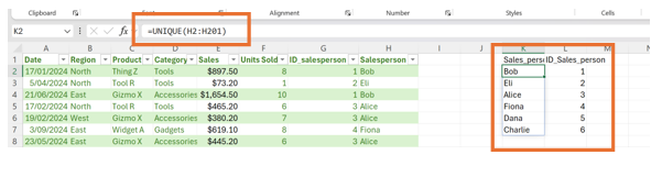
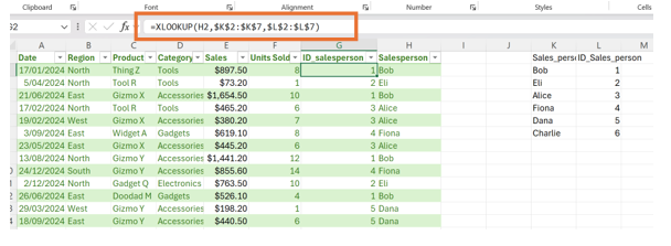
Created a reference table containing all unique salesperson names with assigned numeric IDs. sed the XLOOKUP function to link names from the main dataset to their corresponding IDs.
Step 2: Tools & Skills Demonstrated
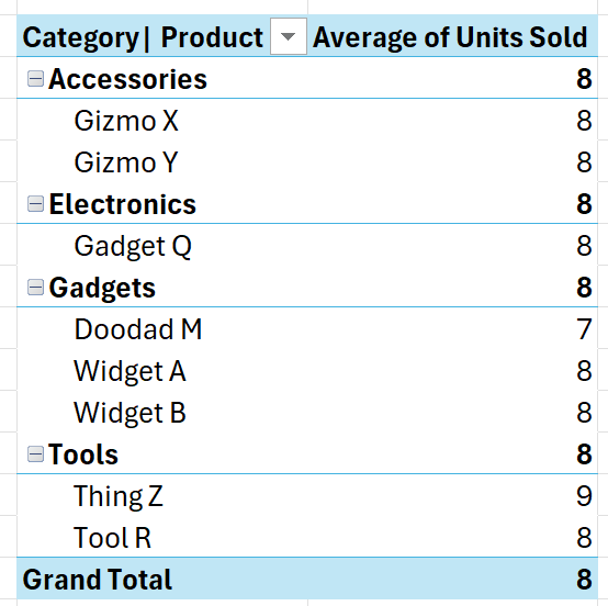
Step 3: Creating PivotTables
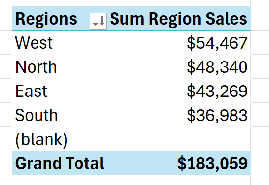
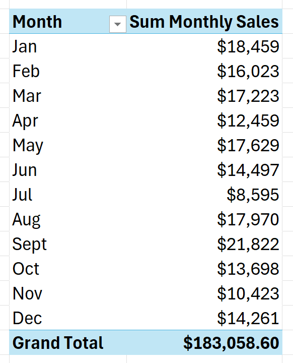
PivotTables were inserted in a separate worksheet named Pivot_Tables to summarize the dataset and support dashboard visualizations:
Step 4: Pivot Charts & Slicers
PivotCharts were created based on the tables above to provide clear, visual insights. Slicers were added for dynamic filtering by:
This makes the dashboard highly interactive and user-friendly.
Final Output: Interactive Dashboard
The final dashboard allows users to explore 2024 sales performance by month, region, product category, and salesperson (via ID). Key metrics displayed include:
With interactive controls and clean visuals, this dashboard provides a dynamic, professional-grade analytics experience built entirely in Excel.
See Complete Project Here- Excel
- PivotTables & PivotCharts
- Dashboard Design
- Data Cleaning & Transformation